

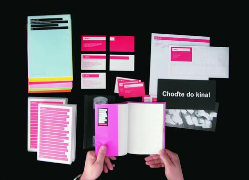
Michal Richtr: Logo also sells a project
Architect, interior designer and graphic designer should closely cooperate from the first moments of existence of a project – says Michal Richtr, of CI.CZ. Richtr is among the leading figures of corporate visual style in the Czech Republic. For many years he worked for C.I.D. (Corporate Identity Design), which designed graphical styles for ČEZ, Czech Post and many other important domestic enterprises. He also wrote CI.CZ’s summarizing publication called Corporate Style in the Czech Republic and an exhibition of the same name, presented in Vienna, New York and Tokyo last year.
At the beginning of 1990s, corporate visual style was something brand new and unknown in our country. Today’s situation is different, but it is always a good idea to repeat the basics. Let’s ignore the elements whose sum constitutes the visual style of an enterprise or institution, and let’s look at it in terms of function.
If we talk about the corporate sphere, visual style has two principal aims or functions and their mutual relationship depends on the goals of the entity on the market it enters. The basic function of a visual style is the identification of its carrier – i.e. it shows who I am and where I belong, what values I represent. There are industry-specific rules of visual style at play in this respect, i.e. the presentation of banks is different than the visual communication of a producer of soft drinks, for example. At the same time, however, and I am talking about the other function, the firm has to be distinguished from its competitors. Of course this is even more so on a highly saturated market with tough competition.
Fall in a specific field and at the same time differ competitors in the same field – it sounds contradictory?!
It may sound so, but it is true. The industry-specific rules I mentioned above are very loose. The fact that the graphical presentation of banks is usually rather conservative in terms of graphical symbolism as well as choice of colours does not mean that the visual style of any bank cannot be approached in a wholly different manner. It depends on the specific, current need. Some time ago in C.I.D. we prepared a visual style for the successor of ČP Leasing. The original owner sold the company to Sofinco and its management wanted two things at the same time: signal the principal change that the company went through and distinguish it from competitors significantly within the whole financial sector. We started with the new name Credium, which “conformed” with the industry, and selected three points or red circles as a graphical symbol – again rather traditionally, as a symbolic depiction of money, the company’s three main products and an expression of certainty, always represented by a fixed point in free space. However, the colours of the logotype were based on the need to distinguish the company from others, so we selected a combination of green and blue. At that time this combination was used for example by OMV, but in finance it was something completely new. And that was the point – define the company on the market understandably, but at the same time highlight it against its competitors within its industry
Is a visual style more important for some fields than for others?
Not really. As a general rule, a serious company with a competitive product has a high-quality visual style. But you probably mean architectural or design studios and development companies. Of course, if someone makes a living by selling design in any form – and architecture is designing – it is automatically assumed that its own design is excellent. But it should be stressed here that it is the product that is always in the centre of focus; if the product’s quality and price do not match the market needs and do not satisfy demand, nothing can salvage the firm, not even an outstanding visual style. It is just another reference. It is true that in circumstances in which individual products are more or less comparable and clients often look at emotional aspects in their choice, this type of reference is important. An indistinct or even bad logo, an unsuitable corporate name or an unfriendly and unpleasant interior, which is another part of the visual style, can play their role in the final choice – but will never be the core parameter.
What is the situation about visual style in development, are there any rules, special laws, reference samples?
I would say that the situation in this area is quite complicated, it cannot be compared with carmakers or banks. The extent of development is too broad and searching for common graphical elements or style for a “manufacturer” of residences, logistics parks and business complexes is different and close to impossible. But I feel than development companies need to communicate their products instead of themselves. The process is virtually the same. You have to start by defining your mission and your keywords, which should reflect the project’s exceptional properties or qualities; the next step should focus on the name, and then the logo and its graphical symbolism and colours. Some time ago, for example, I participated in the formation of a visual style for the River Park project in Bratislava. The developer’s intention was to build an architecturally exceptional building in a unique location. A clear mission from which you can rather easily generate a name that would emphasize the location and the complex nature of the project, and the graphical elements of the logo, built on simple shapes and a combination of blue and green. It looks easy at the first sight, but it is not quite true. One of the problems is that you may not find such attributes of exceptionality in each project.
However, name and logo are not the only elements of visual style for architectural works?!
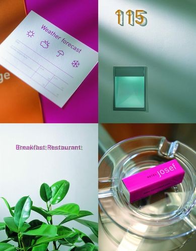
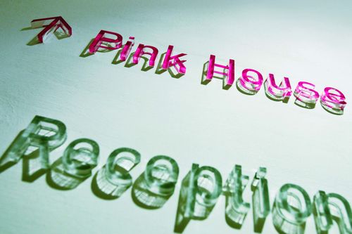
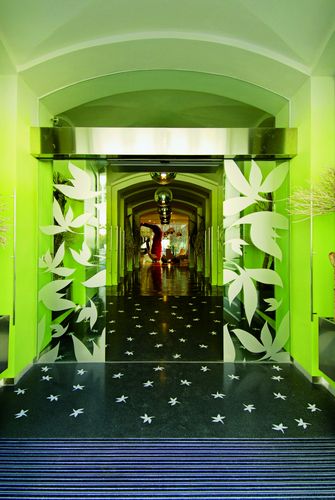
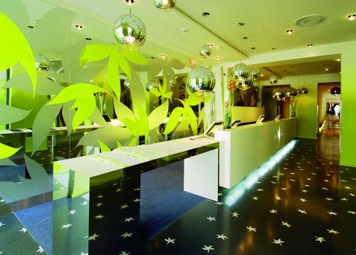
Of course, it is just a decoration, a strawberry in a glass of Champagne. Ideally you have to think about the visual style as early as at the stage of first designs. Architect, interior designer and graphic designer should closely cooperate from the first moments of existence of a project, because the results of their work should be harmonious and interconnected. The building’s mass and exterior should match the character of its interior, which should in turn conform to its information system, logo and corporate press. However, each project has a different link between architecture and design. Sometimes it is weak, sometimes strong, for example in design hotels. In that case the visual style covers even the colour of linens.
What about domestic corporate design in general?
I would say the situation is growing better. The desire to efficiently communicate with the surroundings is obvious in most domestic firms. And there are a growing number of domestic medium-sized and small enterprises and even family firms interested in an elaborate corporate design – for example law offices. The awareness that you have to have a top-quality product and top-quality presentation and communication is perhaps already universal. However, the outcome is not always ideal; the problem is that it is so hard to measure. That is why many firms choose cheaper methods and solutions, which goes hand in hand with the current condition of the Czech economy. There may be even more saving in this field in the near future, especially since the visual or graphical style does not seem to be fatal from a purely economic point of view. But appearances are deceptive. Visual style “makes” the company, just like clothes “make” the man.
 Jagg.cz
 Linkuj.cz
 Google Bookmarks
 Live bookmarks
 Digg
Digg Del.icio.us
 MySpace
 Facebook